Real-time alarm ingestion
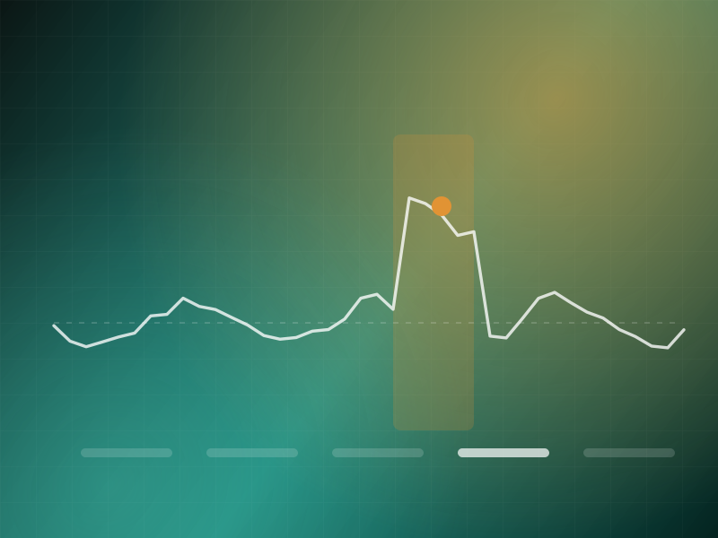
High-volume alarm streams normalised across vendors into a common event schema.
Not alarm detection. Failure hypothesis reduction.
A correlation engine that turns an alarm storm into a short ranked list of probable root causes by reasoning over network topology and fault propagation rather than alarm counts.
01 · The problem
A single core failure produced eleven thousand alarms in nine minutes. The NOC's tooling ranked by severity and volume, which meant the loudest downstream symptom sat at the top and the actual cause was buried on page forty.
Engineers had learned to ignore the tool and reason from topology diagrams by hand. That works when one senior engineer is on shift and fails completely at three in the morning.
02 · What we did
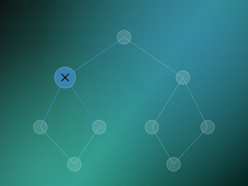
We modelled the network as a dependency graph and treated an alarm storm as evidence to be explained. The question stops being which alarm matters most and becomes which single failure best accounts for everything observed.
Fault propagation rules encode how a failure at one node manifests downstream. Candidate causes are scored on how much of the observed alarm set they explain and how little they leave unexplained, which collapses eleven thousand alarms into three hypotheses.
The loudest alarm is almost never the broken thing.
Two of the screens that carry the most weight in daily use, rebuilt here from the production design system.
Eleven thousand alarms, three hypothesesCandidates are ranked by how much of the observed alarm set each explains, and what each leaves unaccounted for.
Impact in service termsEscalation is driven by the service map rather than by alarm volume, so the loudest symptom stops setting priority.
Grouped by the job each set of capabilities exists to do, rather than by which team built it.
High-volume alarm streams normalised across vendors into a common event schema.
A live dependency graph built from discovery, inventory and routing state rather than a static diagram.
Continuous comparison between documented and observed topology, because the diagram is always slightly wrong.
Customer-facing services mapped onto infrastructure so impact is expressed in service terms.
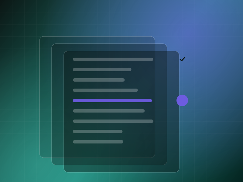
Alarms grouped into incidents by topological and temporal relationship instead of by text similarity.
Encoded rules for how a failure at a node manifests at its dependents, used to predict expected symptom sets.
Hypotheses scored on explanatory coverage: how much of the observed set each accounts for, and what it leaves over.
Unexplained alarms are surfaced explicitly rather than quietly dropped from the story.
A written incident narrative with affected services, probable cause and supporting alarms.
Customer and service impact computed from the service map, not estimated from alarm counts.
The propagation sequence rendered in order so an engineer can verify the reasoning.
A complete record suitable for review and regulatory reporting.
Layer by layer, with the reason each one exists, because the reason is usually the interesting part.
Streaming pipeline handling burst loads an order of magnitude above steady state without dropping events.
Graph database holding the live dependency model with temporal versioning so past incidents are reasoned about against the topology of the time.
Rule and model hybrid that predicts expected symptom sets for candidate failures and compares them against observation.
Structured incident facts rendered into readable summaries with every claim linked to its supporting alarms.
NOC workspace with live incident view, topology overlay and timeline reconstruction.
Technology
Measured against how the operation ran before, not against a benchmark chosen after the fact.
Storms became incidents. Engineers work a short hypothesis list instead of paging through alarm tables.
Junior engineers reason like senior ones. The topology knowledge that lived in a few heads is encoded in the model.
Unexplained signal is visible. The system says what it cannot account for instead of presenting a tidy incomplete story.
Impact is stated in service terms. Escalation decisions stopped depending on alarm volume.
How it ran
Built the dependency graph from discovery and measured how far documentation had drifted from reality.
Pipeline sized for storm conditions rather than steady state.
Encoded propagation rules and validated hypothesis ranking against a year of resolved incidents.
Live incident view, narrative summaries and post-incident export.
From defect detection to defect causality.
A multimodal system that correlates line video, machine telemetry, batch records and operator actions to explain why a defect happened, not merely that it did..
From a single inspection to longitudinal asset integrity.
A vision system that detects and localises pipeline deterioration, then tracks each defect across inspection cycles so maintenance is prioritised by progression rather than by appearance..
From deviation to evidence, with the audit trail intact.
A deviation investigation assistant that assembles batch records, equipment telemetry, inspection imagery, SOPs and historical deviations into an evidence-linked case file a quality unit can defend to a regulator..
Tell us what you run. We will get back to you as soon as possible with what we would build for your situation and, just as usefully, what we would leave out.